If you notice missing images, your browser’s ad blocker may be filtering advertising examples on this page. Disabling it for this website will reveal the full content.
Two-thirds page ads occupy a comfortable middle ground: generous enough for a detailed marketing message, high-quality imagery, and a clear call-to-action, yet still constrained enough to demand hierarchy and restraint. In magazines and technical journals, this format allows a product to speak with authority without overwhelming the surrounding editorial content.
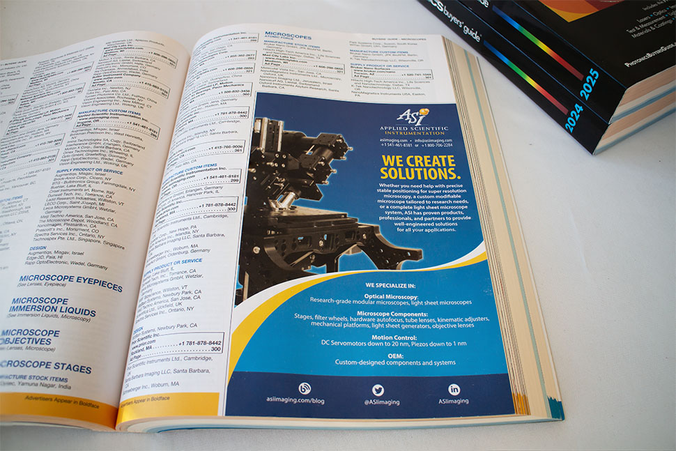
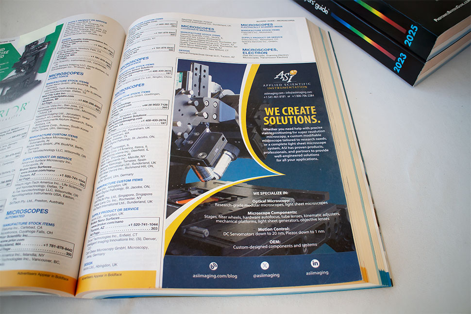
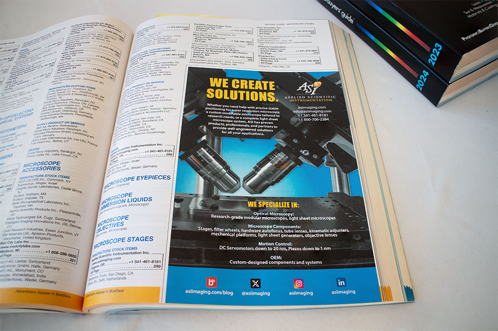
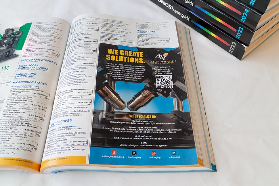
So far, I have designed in this format four times—each for Applied Scientific Instrumentation’s placement in the annual Photonics Buyers’ Guide, published by Photonics Media. The Buyers’ Guide is a substantial volume in which hundreds of optics companies are listed and featured. Visibility there is not automatic; it must be earned on the page.
All four ads share a strong family resemblance. This was largely the client’s decision. The first iteration proved successful enough that consistency became the strategy. When something works in a reference book people return to throughout the year, familiarity can be more valuable than novelty. The designer’s role, then, is to refine rather than reinvent.
At the same time, I approached the redesign with a different premise than earlier versions created before I began working with ASI (you may compare them here). In a predominantly white publication, I felt the ad needed a decisive tonal field—at least a darker background—to interrupt the rhythm of white pages and immediately attract attention. Contrast, in this context, becomes not decoration but navigation.
These ads therefore balance continuity and emphasis: stable structure, disciplined typography, and imagery presented with enough depth to suggest precision without visual noise. In a book where every company wants to be seen, the quiet strategy is simple—be clear, be confident, and give the eye a place to land.