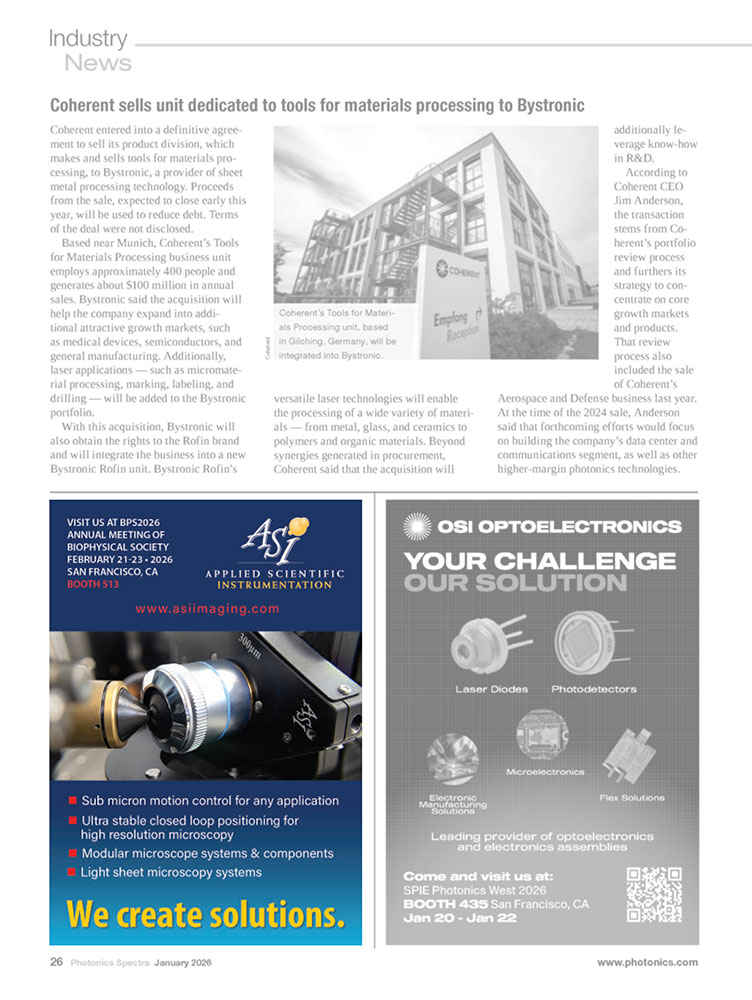
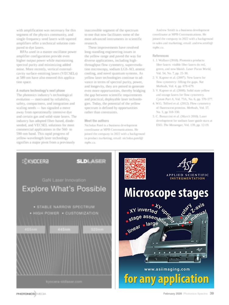
If you notice missing images, your browser’s ad blocker may be filtering advertising examples on this page. Disabling it for this website will reveal the full content.
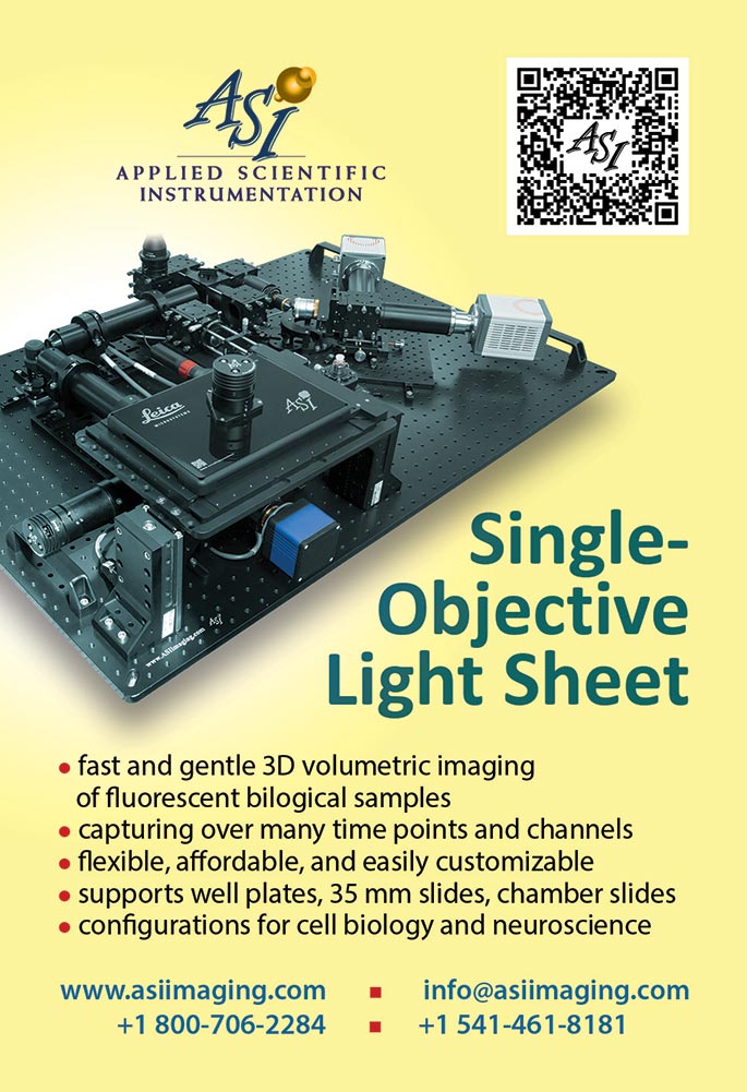
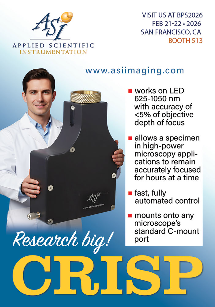
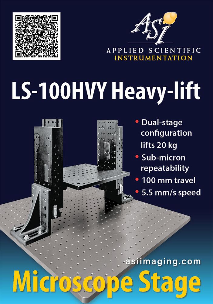
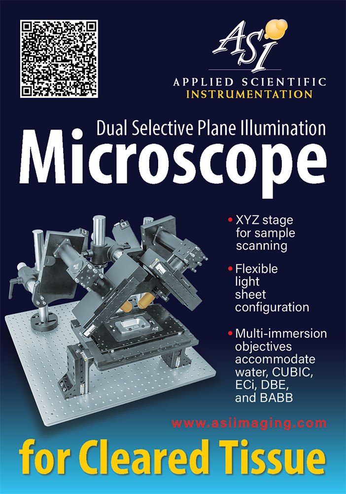
Quarter-page ads are a compact but demanding format. They are small enough to enforce discipline, yet visible enough to require clarity. I approach them as condensed design systems rather than reduced posters.
I deliberately avoid settling into a single fixed style, but I am equally cautious of drifting into unchecked eclecticism. My working compromise is temporal consistency: typography, layout logic, and visual language remain coherent for a limited period—typically no longer than a year—before being consciously refreshed. This allows continuity without visual fatigue.
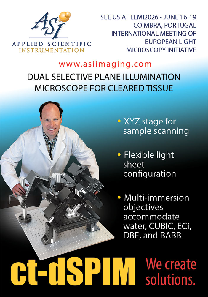
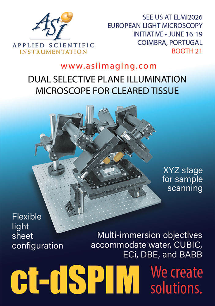
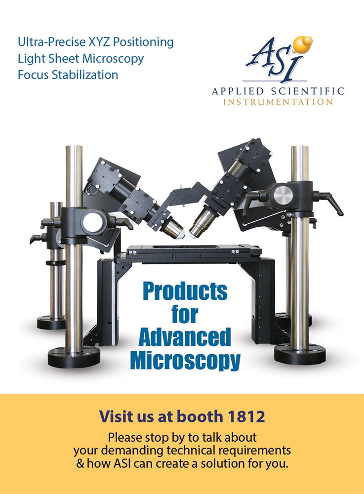
Whenever possible, I aim to humanize advertising. A real person—observing, interacting, thinking—adds narrative and scale that isolated products rarely provide. Scientific instruments exist within human practice, and ads become more engaging when they acknowledge that context instead of presenting objects in isolation.
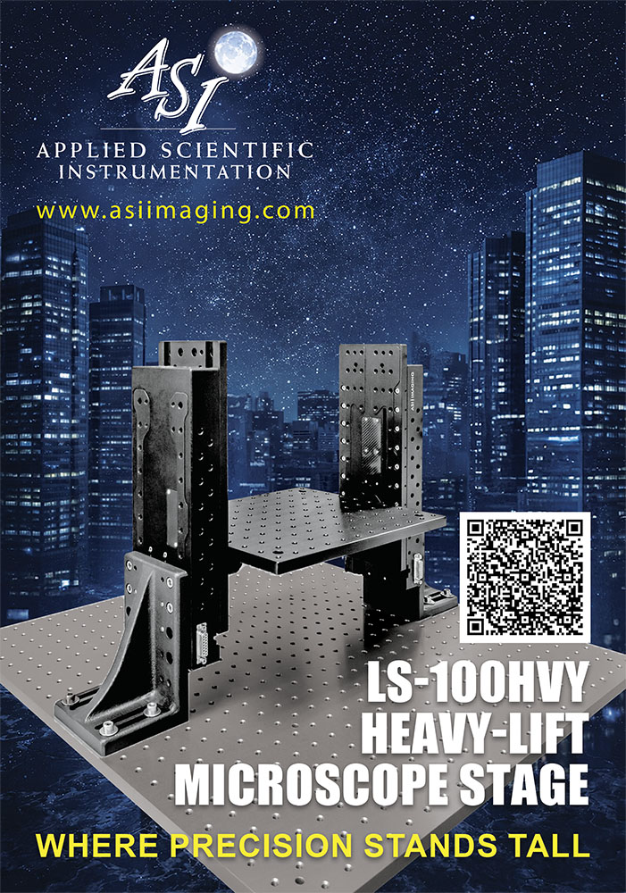
Most ads shown here feature products by Applied Scientific Instrumentation and are therefore connected to optical microscopy. The color palette reflects the company’s brand identity: blue and yellow as structural anchors, with occasional red accents—allowing the classical red–blue–yellow triad to guide the compositions.
The quarter-page ads presented were produced primarily within the last five years. Several were published in BioPhotonics and Photonics Spectra by Photonics Media (Laurin Publishing), while others appeared in printed programs for workshops, symposia, and scientific conferences.
On this page, the ads are shown in context: full publication pages with surrounding material desaturated and subtly softened. Selecting a page reveals the ad at full scale, and links to electronic editions are provided where available.