

If you notice missing images, your browser’s ad blocker may be filtering advertising examples on this page. Disabling it for this website will reveal the full content.
Half-page advertisements come in more than one shape. Some occupy the entire width of a page's lower portion, while others appear as compact, vertically oriented islands surrounded by editorial content. Both are classified as half-page formats, although their proportions and visual behavior differ considerably. Apparently, in advertising terminology, half a page does not always look like half a page. For a designer, however, the distinction matters.
Half-page island
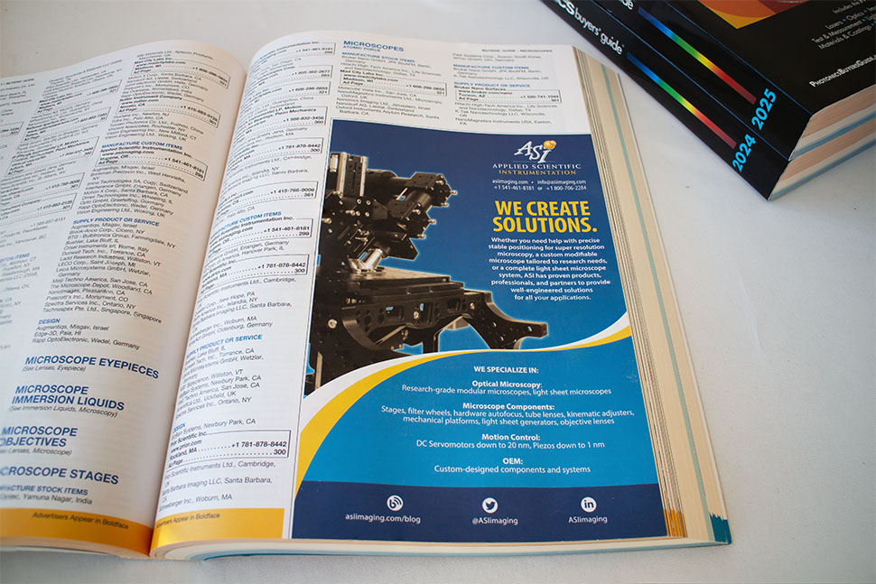
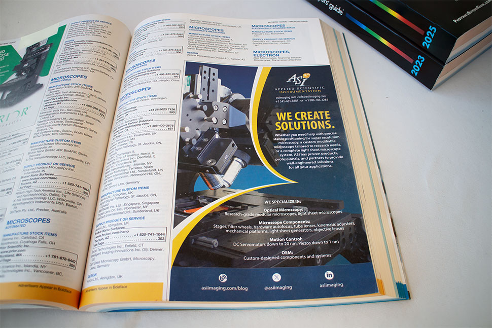
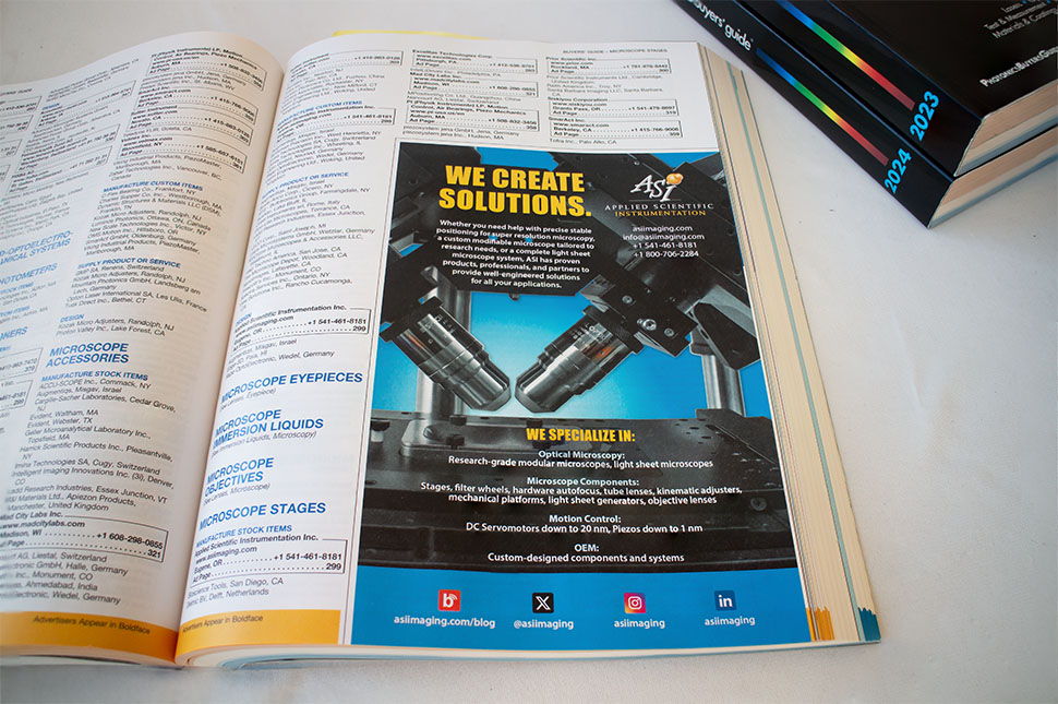
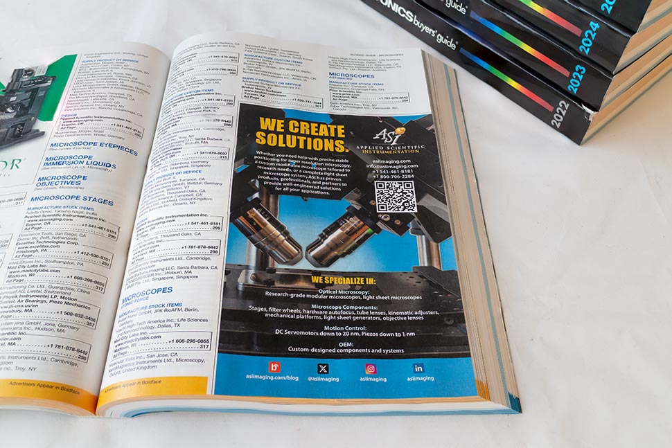
The first group presents four advertisements designed for Applied Scientific Instrumentation's placements in the annual Photonics Buyers’ Guide, published by Photonics Media. This substantial reference volume lists and features hundreds of companies working in optics and photonics. Its readers include researchers, engineers, manufacturers, and other professionals looking for instruments, components, and solutions. In such a crowded environment, visibility cannot be taken for granted.
The island format provides a relatively generous vertical space for a detailed marketing message, high-quality imagery, and a clear call to action. All four advertisements share a strong family resemblance, largely at the client's request. The first iteration apparently proved successful enough to establish a visual direction worth retaining. When a publication serves as a reference throughout the year, familiarity and recognition can be more valuable than constant reinvention. The designer's task becomes refinement rather than revolution.
Nevertheless, my approach differed from the earlier advertisements produced before I joined ASI (a comparison is available here). In a publication dominated by white pages, I felt that the advertisement needed a decisive tonal field—a dark or strongly colored background—to interrupt the visual rhythm and attract attention. Contrast here is not merely decoration; it is a navigation device. The resulting designs balance continuity with emphasis: a stable structure, disciplined typography, and product imagery presented with enough depth to communicate precision without unnecessary visual noise.
Horizontal half-page
The second group consists of advertisements designed for printed programs of the Advanced Imaging Methods workshops held at the University of California, Berkeley, over several years. Each promotes the same optical instrument, gradually refined and improved over time. This reflects a familiar reality of scientific product development: progress is usually evolutionary rather than theatrical, and advertising must communicate that progress without pretending that every new edition represents a revolution.
Designing for the same product year after year might appear repetitive from the outside. In practice, it is an instructive constraint. The client remains the client, and the designer's responsibility is to preserve consistency as carefully as to introduce variation. When the principal message, product imagery, and technical specifications change only modestly, attention shifts toward subtler decisions: composition, alignment, visual hierarchy, and color. I deliberately explored these elements across successive editions to keep the advertisements visually fresh while remaining faithful to the instrument and its actual development.


The two formats demonstrate different ways of working within the same nominal advertising space. One relies on a vertical island that must stand out among surrounding editorial material; the other uses the full width of the page to establish a more conventional horizontal composition. Neither offers unlimited freedom, and neither needs it. A good half-page advertisement should occupy precisely the space it is given—visually, not just physically.