If you notice missing images, your browser’s ad blocker may be filtering advertising examples on this page. Disabling it for this website will reveal the full content.
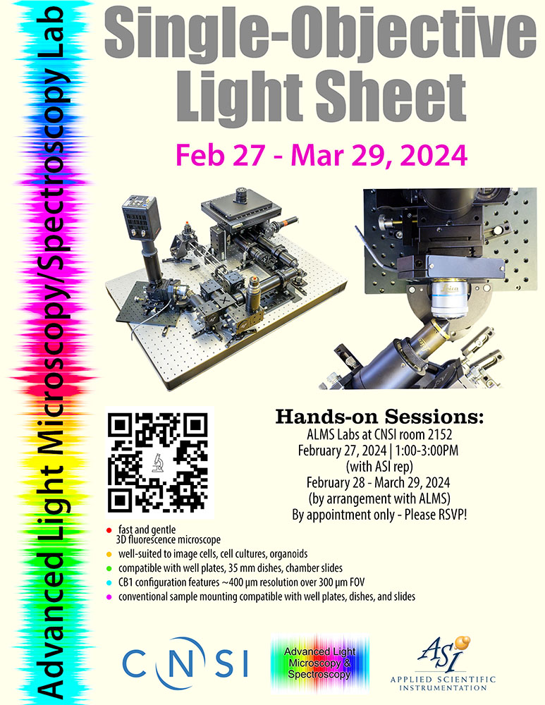
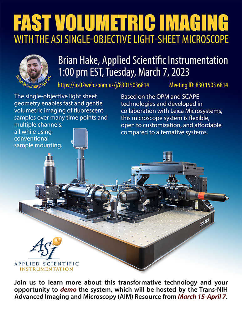
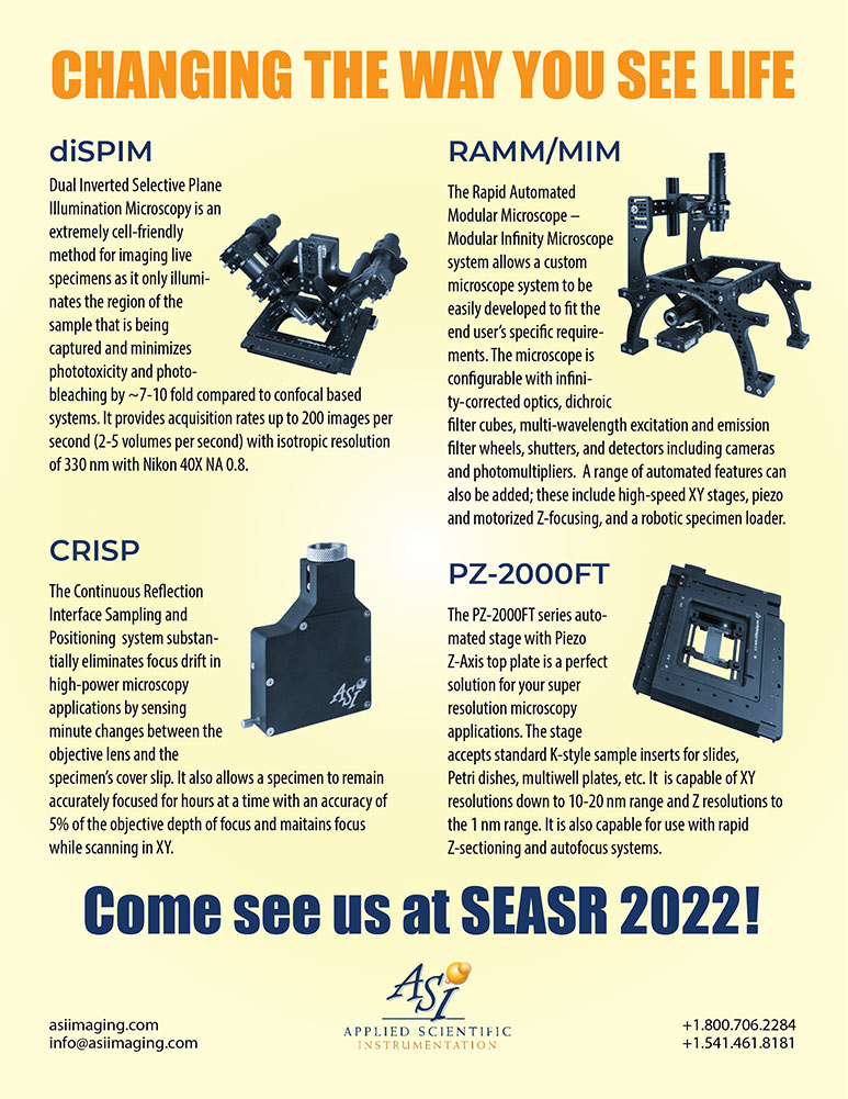
I approach flyer design with the assumption that my audience is intelligent, busy, and allergic to unnecessary visual noise. Each of these pieces is built around a clear hierarchy: a headline that earns attention, a strong visual anchor, and supporting information that can be absorbed quickly—or read more carefully by those who want the details. The goal is not to impress with decoration, but to communicate complex ideas without making the reader work harder than necessary.
Although the subject matter is technical, the design process is intentionally human. Color is used as a guide rather than a distraction, typography carries structure as much as style, and product photography is treated as the main character—not an afterthought. Whether the flyer promotes a workshop, a talk, or a conference presence, I try to strike a balance between precision and approachability. In short: serious content, clearly presented, with just enough restraint to let the science speak for itself.