
Posters occupy an interesting position between publication and performance. Unlike journal articles, they are meant to be read standing up, often at a distance, and usually in competition with dozens of other posters in the same room. A good poster must therefore do several things at once: attract attention, organize information clearly, and reward closer inspection without overwhelming the viewer. In that sense, poster design is less about decoration and more about choreography—guiding the eye through a dense field of content with as little friction as possible.
The first poster, 1-Diethylamino-3-phenylpropine-2-hydrochloride: Synthesis and testing of antimicrobial activity, was presented at the international conference “Physico-Chemical Biology as a Base for Contemporary Medicine” in Minsk (2021). I was one of the co-authors and responsible for the visual design. The overall tone is intentionally bright and restrained: a white background supports legibility and allows the scientific content to remain primary. Structurally, the poster follows a classical multi-column layout, where text blocks, diagrams, and images are aligned to maintain rhythm rather than compete for attention.
Color here is quiet but deliberate. The purple of Vitebsk State Medical University and the green-and-yellow of the University of Oregon suggested a natural extension into blue, forming a balanced tetradic palette. This was less a theoretical exercise than a practical one: the colors coexist without conflict and help segment information without resorting to heavy graphic devices. Even the chemical scheme at the bottom reads as part of the composition rather than an afterthought—anchoring the page while subtly guiding the viewer from left to right.
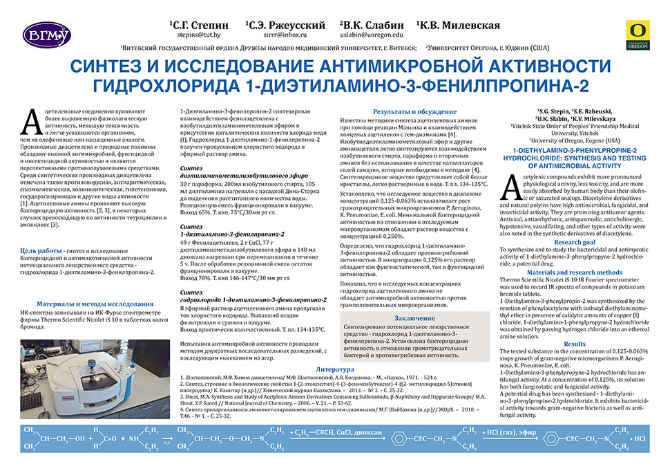
Presented at Physico-Chemical Biology as a Base for Contemporary Medicine international conference, Minsk, Belarus, 2021 [in Russian].
Presented at Science and Technology Education: New Developments and Innovations 5th international Baltic symposium on science and technology education, Šiauliai, Lithuania, 2023.
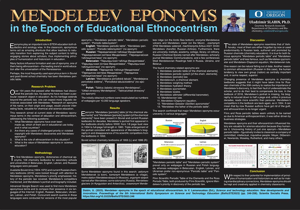
The golden title lettering in the black poster incorporates characters designed by Agzam Gaisin (Kazakhstan), used under the Pixabay Content License (Pixabay)—a detail I was happy to discover at the right moment.
The second poster, Mendeleev eponyms in the epoch of educational ethnocentrism, presented at the 5th International Baltic Symposium on Science and Technology Education (Šiauliai, 2023), takes a different approach. Here I was the sole author, presenter, and designer, which allowed for a more unified—and perhaps more assertive—visual statement. If the first poster is quiet, this one is intentionally more theatrical.
The black background immediately changes the terms of engagement. It creates contrast not only with the surrounding posters but also within the poster itself, allowing light text and images to emerge with greater clarity. The title in gold capital letters—borrowed, with credit, from another type designer—introduces a degree of formality and historical weight appropriate to the subject. Yellow section headings, a light blue subtitle, and restrained red accents form a classical triad that, knowingly or not, would have been quite acceptable to Piet Mondrian. The result is a controlled tension: visually rich, but still readable at distance.
Both posters share a common structural concern: hierarchy. Large initials, clear sectioning, and consistent alignment allow the viewer to navigate quickly, even when the content itself is dense. At conferences, this matters more than any individual design decision. A poster is rarely read linearly; it is scanned, sampled, and only then read in fragments. Designing for that behavior is part of the task.
There is also a practical dimension to this work. Posters must survive printing, transport, mounting, and varying lighting conditions. The white poster tolerates uneven lighting well; the dark poster relies more on controlled contrast and therefore demands better placement. These are not theoretical concerns—they are part of the design process, just as much as typography or color.
If there is a common thread between the two, it is not style but intent. One is quieter, the other more emphatic; one recedes, the other advances. Both aim to make complex material accessible without simplifying it beyond recognition. And both remind me that, in the end, a poster is not just something to look at—it is something to read, to approach, and occasionally, if it does its job well, to remember.