
Although I have written many articles over the years, the examples presented here focus less on authorship and more on editorial design. The goal was to arrange text, imagery, and typography into compositions that reflect the visual logic of specific magazines. I selected two loosely related themes—Napoleon Bonaparte and the Napoleon cake—and explored how these subjects might appear if treated by very different editorial voices. Before designing each article, I studied the publications themselves, paying attention to their tone, structure, and readership. The resulting pieces are therefore exercises in stylistic translation: the same historical figure interpreted through three distinct editorial personalities.
Text and images used for educational and design demonstration purposes.
This article mimics the visual language of Star Magazine, a long-running weekly devoted to celebrity culture. Its editorial tone is cheerful, energetic, and unapologetically dramatic—an atmosphere where intrigue, romance, and scandal are presented with equal enthusiasm. Layouts tend to be dense and visually restless: two-, three-, or four-column grids compete with tilted photos, bold captions, and very little negative space. Predictability is avoided; every page aims to feel like the next twist in a celebrity storyline.
To echo that style, I adopted a similarly lively typographic palette. The headline uses a bold sans serif reminiscent of Star’s typical display fonts, while the subhead employs an italic serif to keep longer text readable. Bright colors and playful symbols—such as heart-shaped dingbats—reinforce the magazine’s light, gossip-driven voice. The result is a design that treats Napoleon and Joséphine as if they were modern celebrities whose relationship status might change between issues.
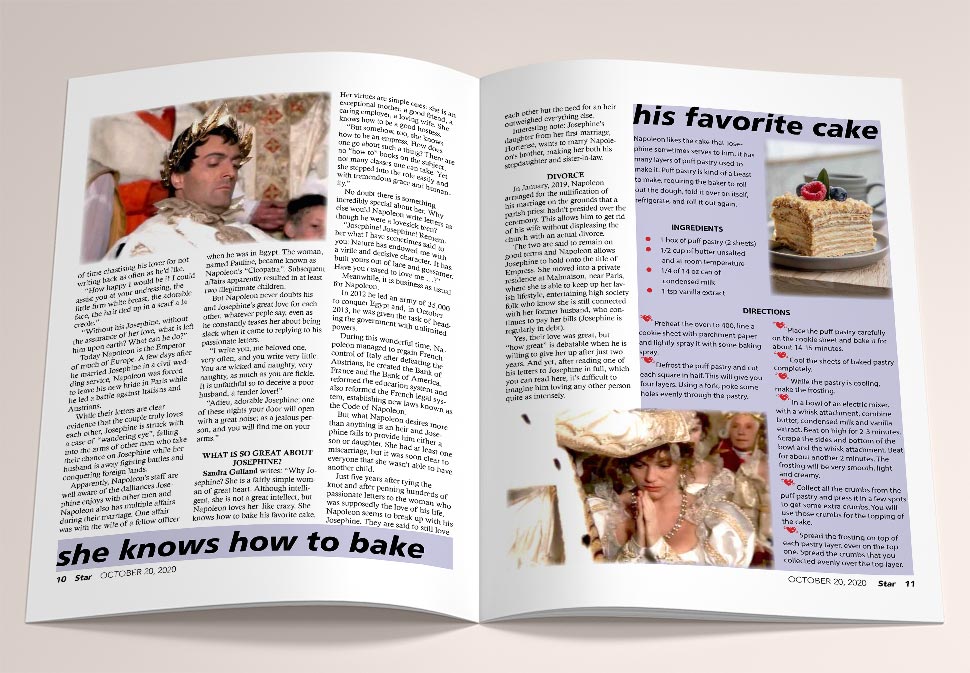
The cake photo borrowed from Marina.
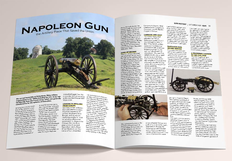
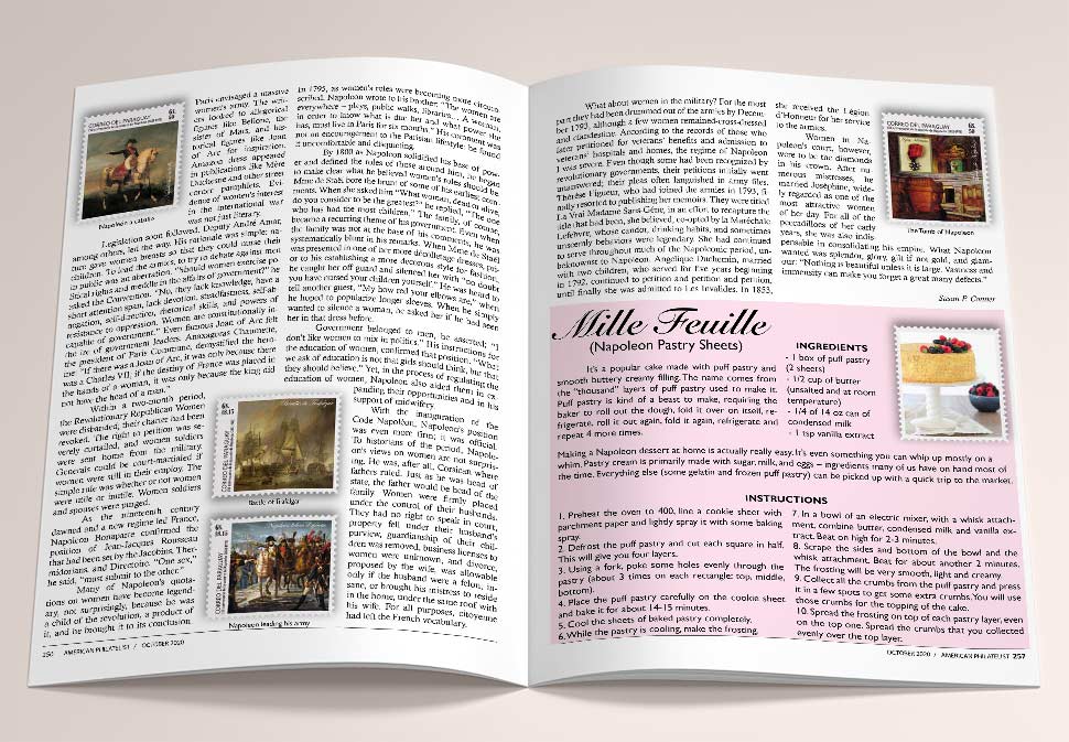
This article imitates the visual discipline of Guns and Ammo, a magazine focused on firearms, military history, and technical expertise. Its editorial voice is structured and confident, emphasizing precision, reliability, and mechanical detail. The layout is typically orderly, with consistent column grids and clearly defined headings that guide readers through dense informational content.
For this project I chose a headline typeface with engraved or historical associations—Copperplate—to convey gravitas and a sense of military tradition. Supporting typography remains restrained, allowing photographs and diagrams of the artillery piece to carry much of the visual weight. Even decorative elements serve a purpose: a small thematic dingbat marks the recipe-like steps in the narrative structure, demonstrating how even highly structured layouts can incorporate a touch of wit.
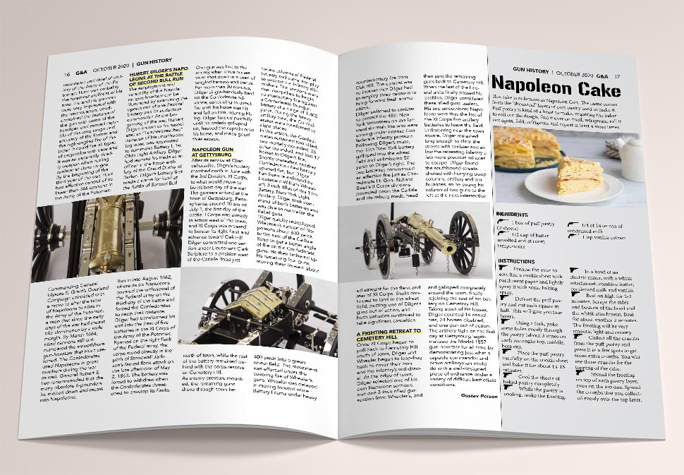
Text adapted from an article by Gustav Person. An archived version of the source is available here. The cake photograph is courtesy of Spruce Eats.
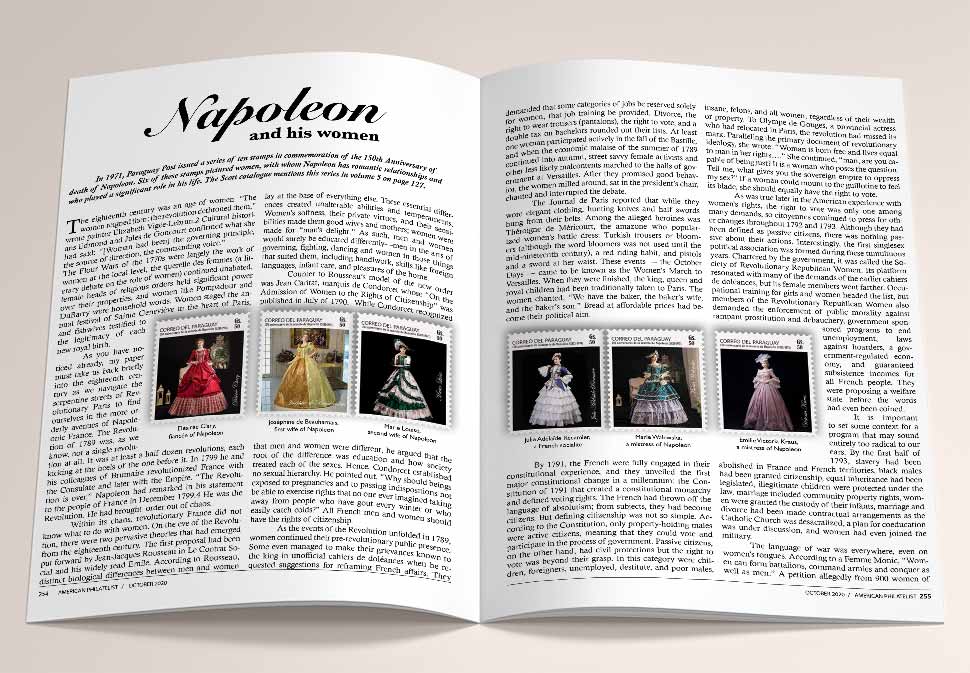
This article takes inspiration from The American Philatelist, the long-standing magazine of the American Philatelic Society. Its tone is patient and scholarly, reflecting the values of collectors who appreciate historical continuity and careful documentation. The layout typically favors a stable two-column structure and traditional typography, reinforcing a sense of reliability and heritage.
Because high-resolution images of the relevant stamps were difficult to obtain, I recreated their visual equivalents digitally. The stamps are arranged in a straightforward comparative layout—exactly the way collectors prefer to study them. Philatelists often examine details of printing, denomination, and design before reading the accompanying text, so the composition gives priority to clear, orderly presentation. In this way the article becomes not only a narrative about Napoleon and the women connected to him, but also a small demonstration of how editorial design adapts to the expectations of a very specialized audience.
The cake photo borrowed from Olga.